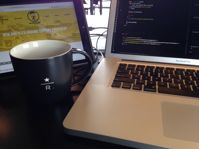
Mobile GSE
Mobile GSE works in the field aeronautics. We often only think about the airplanes at an airport, but in order for everything to go smoothly on the tarmac, all kinds of vehicles are needed, from vehicles that tow the planes, vehicles that carry bagage, mobile staircases to help people get on the planes, and many more. All of these vehicles are called Ground Support Equipment, or GSE.
Mobile GSE is renowned for offering on-site support for Ground Support Equipment anywhere in the world. When you have an emergency GSE repair to be done, these are the guys you want to call
mobilegse.ca
The Brief
Mobile GSE needed a website that reflected the quality and professionalism
that they bring to their field. We also wanted to create an engaging and
memorable brand for the company to make them stand out in their unique market.
Branding Approach
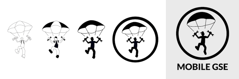
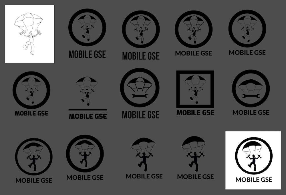
Initially, I was presented with a logo concept that Josh from Mobile GSE already had: a parachuting man brandishing two wrenches. It reflected that company’s service in a unique way, so we decided to keep the concept. However, there were a few technical issues that we needed to solve.
1. Visibility
One of the first questions I ask when working on a logo is, “Will it scale?” While the initial logo was well done, the thin lines made it hard to see at small sizes. So the first step was to fill in a lot of the whitespace with black to make it more visible.
2. Simplicity
A great logo takes lots of time to develop but shouldn't take much time to draw. So even though details make a logo look nice, they add to the complexity. We experimented with ways to simplify it and strip out any unnecessary details.
The three basic elements in the logo that had to stand out were the man, the parachute and the wrenches. Everything else was on the chopping block. We got rid of the knapsack straps, thickened the lines on the baseball cap, made the parachute into one big shape instead of three sections, eliminated the sleeves on the man’s t-shirt, to mention just a few.
The result was a much more polished and a simpler logo. If I was asked to draw it in 10 seconds, I could get all the main parts of the logo down on paper without too much difficulty.
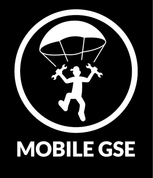
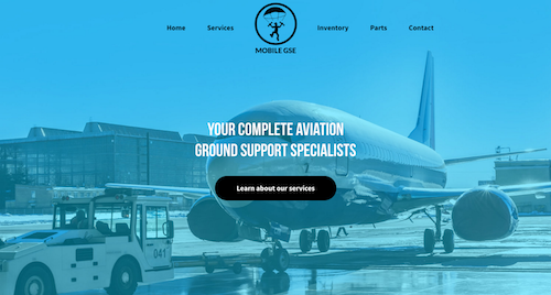
Colours
Right from the beginning, Josh told me he wanted his site to look "cool"; something lively.
So by combining good quality pictures with vivacious colours, we were able to give a
professional look with a bit of a rebellious edge.
Far too many aircraft-related companies sport dark-blue or red colour themes and we wanted to
break out of that box. Mobile GSE offers a unique service to it’s customers, so opted
for a unique colour scheme to reflect that.
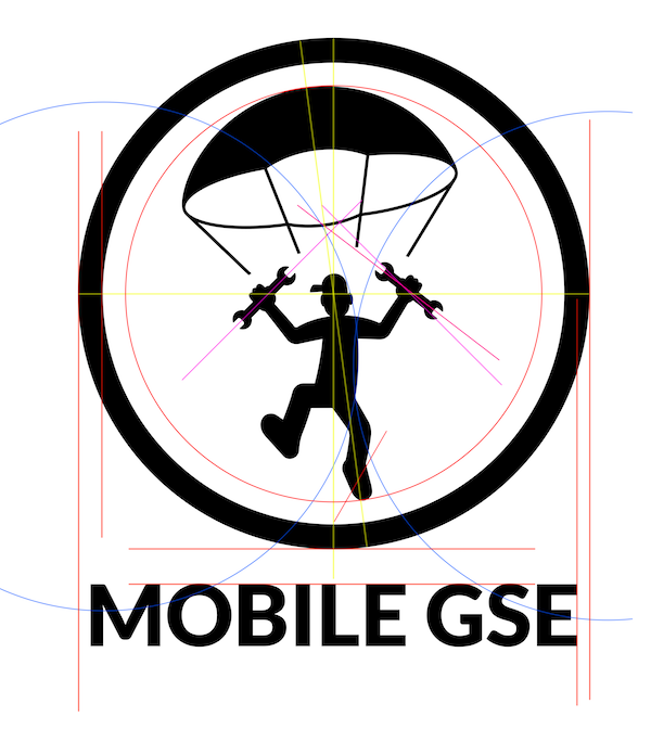
Shapes
All the boxes and sections on the site have sharp lines. However, the logo is primarily round. I wanted to keep sections sharp and create a lot of contrast between the colours and the black and white. But I also wanted friendly, inviting buttons to go with the round logo, so I gave them all rounded edges to balance things out a little.
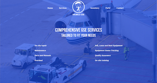
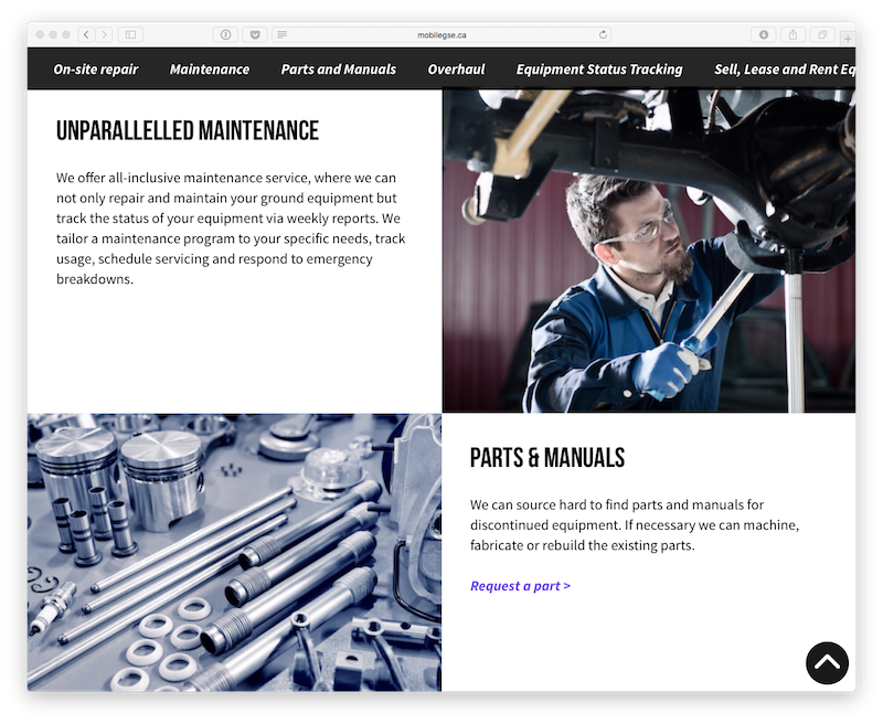
UX
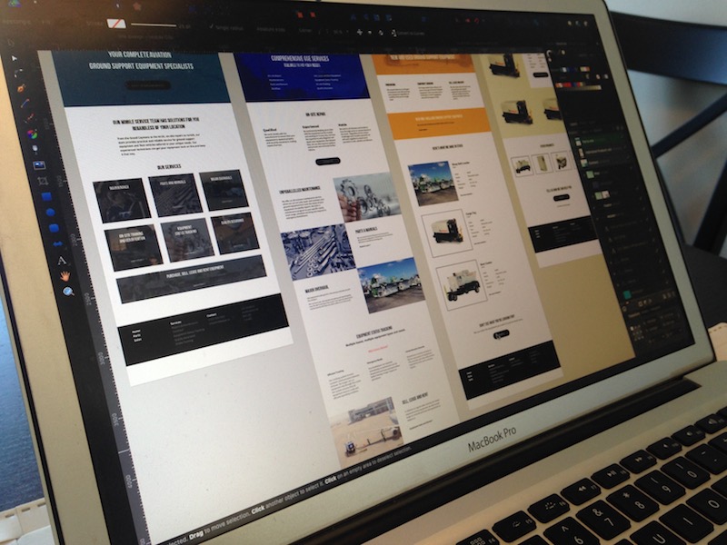
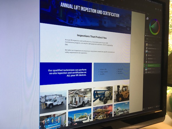
The services page was one of the bigger challenges of the site. We had a lot of brief descriptions of the services that the company offered, so we opted to keep them all on one page instead of splitting them up into a bunch of mini-pages with not much information on them. That way users would have an overview of all the services offered, but enough details about each one to be informative.
This made for a decently long page though, so to help with navigation, we included a “back-to-top” arrow that appears once the user starts scrolling, as well as a side-scrollable menu to help the user navigate though the services without having to go back to the top of the page every time.
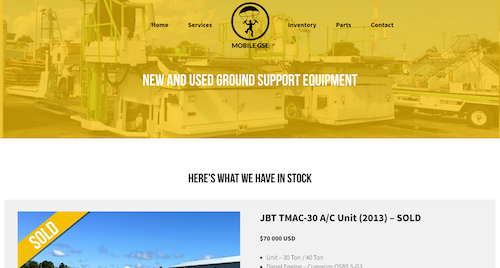
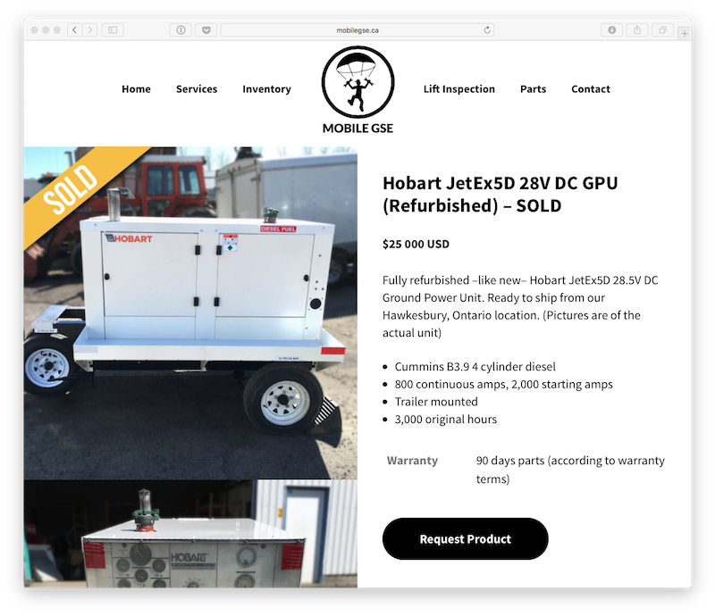
Online Store
Mobile GSE also fixes up and refurbishes ground support equipment and then rents it or sells it to clients. They don’t ever have a huge inventory on-hand though, so we had to create an engaging online store that was tailored to having just a few products at a time.
One big factor we decided to have was to have enough good quality pictures of each product as much as possible. The equipment they sell is not particularly cheap, so we have to make sure that a potential client can clearly see that they product they want to buy is in excellent condition. We managed to achieve that by giving pictures a very prominent place on each product page.
The Outcome
Josh was very happy with the finished product and proudly starting putting the new logo on shirts, caps and anything that could fit it. His website is a dramatic improvement over his former one and he has something he's proud to show his clients.
Ongoing Development
A website is a bit like a car: if it doesn't get maintained, it doesn't fare very well. Once a website goes online, the job isn't necessarily finished. In fact, we only start learning some things about what will work best for a particular company after the site goes live. So we're always on the lookout for things to change, improve or add to keep it fresh and innovative.