Lavpro Estrie
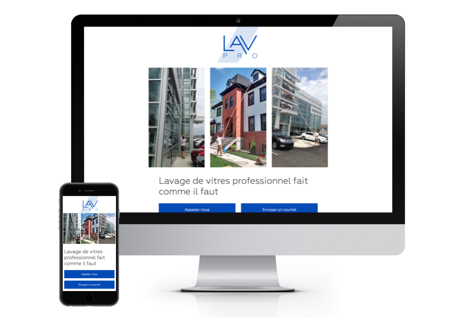
Lavpro is a professional window cleaning company based in the Eastern Townships in Quebec. With 15 years of experience in their domain, they wanted a fresh brand and a website to reflect their personality, and the professionalism and quality that they bring to their work. A logo needs to reflect the company, their values and their philosophy. Lavpro’s aim is to leave their clients with spotless windows. So my aim was to design a logo that was just as clean, with no needless clutter; modern, professional. I kept a very geometric approach to the logo, taking great care to ensure perfect spacing and accurate proportions.

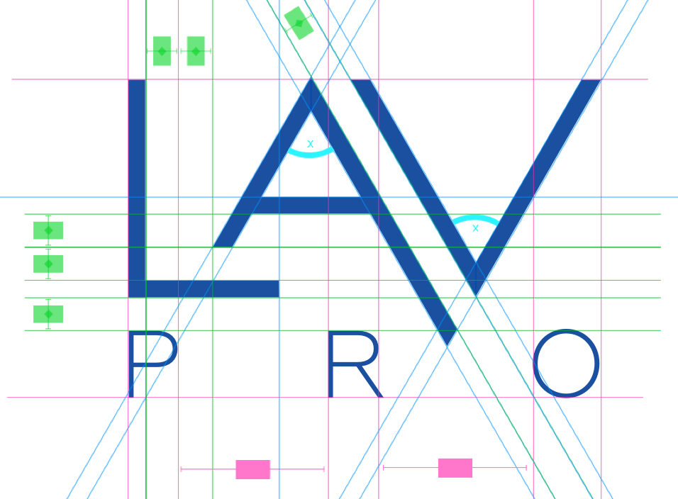
How I made the logo
The following picture shows how I lined everything up. Even though the lines may seem a litle scatterbrained, none of it is haphazard. Angles, line widths, everything matches up to a grid.